Details
My role
I was the sole designer on a team who owned the message center and all social and collaborative experiences on Ancestry. I worked with six developers and one PM and had access to UX Research resources
Tools
Figma, Illustrator, UserZoom, Zoom, Rally
Methods
Competitive analysis, critique sessions, co-design sessions, user Interviews, metric reviews
Timeline
June ‘21 - Feb ’22
Goal
To increase the value of the content at Ancestry by making giving people ways to interact with and share content easily and efficiently.
Our journey
This was a long journey involving several teams and negotiation.
I started by creating an exemplar collection of social media services such as, facebook, instagram, reddit, linkedIn, ect.
3 things in common - React, comment and share
Me and the research team then began trying to understand the content ownership mental model people who use ancestry have.
Some people don’t want people outside of their family being able to comment on things on their tree
Some people want to be able to comment on everything
With those interviews in mind I made two versions with all of the features that a modern social media platform should have.
We then talked with the design systems team about how we could compoentized our designs so that they could easily be reused.

Exemplar compilation
We use them every day so I wont spend too much time explaining them
Testable hypothesis - While none of our direct competitors are using a social sharing model, we can use the models built by the well know social media companies and this will bring familiarity to people on Ancestry.

What people had to say
“ I think it would be great to be able to chat with other people who are working on the same problems I am.”
"I don’t like the idea of anyone being able to make comments on sources (documents) that I have on my tree.”
“ I wish that it was easier to share things that I have found while I am doing my research.”
Takeaways
The content on Ancestry is not what people are used to on a “social” platform
We will need to include ways for people to restrict who can manipulate what they see as “theirs”
There is a desire to share and we need to make that as easy as possible

Comment on leaves
We had to rework the person card so that we could accommodate the comment section and the share option, we specifically did not include a reaction option here to avoid any controversies.
1 Make everything visible
Most of the features of the card were hidden in the “tools” drop down so we brought those out and then added a button to share the profile as well as a place to see and make comments.
2 Reactions
For the comments we wanted to keep reactions limited so we only gave them the option to like.
3 Message center dialog box
We were able to reuse the component from the message center which includes the ability to attach content and add emojis.
Comments side bar
Because of the vast makeup of family trees we wanted people to be able to have one central location to see where conversations are being had.
Social on documents
1 Simplified social bar
This was the start of our social bar and it included the ability to react to the piece of content directly as well as comment and share.
2 Visible counters
Allowing people to quickly see if a certain document has a lot activity on it.
3 Threaded comments
The ability to have threaded conversations is something that was specifically requested by our power users so that they can easily talk through theories and ideas while working through problems. We also retroactively applied this to all other comment sections.
Sharing content
1 Title and image
With the ability to both see the title of the piece of content as well as a thumbnail of the content we hoped there would be minimal cases of people sharing the wrong content.
2 Copy link
Copy link was the most used of the current share options so we wanted people to make it visually distinct and redundant.
3 Large social buttons
Previously the social buttons were small uniquely shaped buttons that were difficult to touch or click accurately so we increased their size and made them uniform to bring visual balance and increase click accuracy.

Universal social bar
After talking with the design system team we simplified our design from the document share page so that it could be reused throughout the product.
Like counter
New comment alert
Split tri button following design system guidelines
Examples of implementation
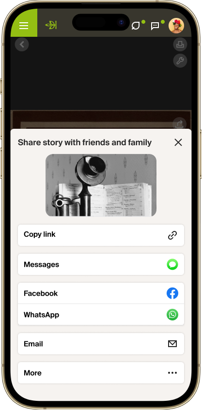
Universal share modal
1 Slide up
We changed to a slide up from a modal so that we could take advantage of the entire screen space.
2 Text / message
By the time we got to our second iteration we were given the green light to add new share mediums and the most requested one was texting.
3 Grouped social buttons
We wanted to group together the social buttons so that they were easy to find, but also not taking up too much room because ultimately we wanted to leave room to emphasize our own message center.
4 More
On mobile we wanted to allow people to access their native share sheet so we added that under the more button.
Overall value added
By distributing the ability to interact and share throughout the Ancestry platform we have created a more social environment that will allow people to connect with others and their past in more vibrant ways than ever before.


